


An incredibly influential graph from some years ago (recreated below using the most recent data) now was the Elephant Graph put together by Branko Milanovic and Christoph Lakner. It was called the Elephant Graph because it looks a bit like an Elephant with a big round back and a trunk.
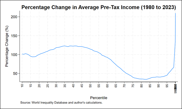
The graph is of global inequality, a concept that takes a bit of understanding, as it combines both the inequality within countries and between them in one big measure- basically treating the whole of humanity as if it were one country. Whilst inequality within countries has grown in many countries, this negative trend was counteracted by inequality between countries shrinking, due in large part to the huge economic growth in China, meaning that the overall trend has been that Global Inequality is falling.
Like all things like this, the graph felt like it captured the political moment, because it demonstrated that there were basically two winners and one loser over the last forty years. The big winners were the bottom half of humanity and those at the very top, and the losers were the ones in the middle- which, especially deciles 60 to 90- basically equated to the bottom half of income earners in rich countries.
For those who were big supporters of globalisation, it showed that there was a clear and definitive global benefit, with hundreds of millions being lifted out of poverty as a result. For detractors of globalisation, it showed how this had happened in many ways at the expense of the working class in rich countries, which in turn had led to the rising tide of right-wing populism and anger, a tide that scarily seems far from ebbing a decade later. For those concerned about inequality, it showed how the very richest had also pulled away at the same time.
What the elephant graph misses
In important ways though, this graph doesn’t really show the full picture. Most notably, this measure, like most inequality measurement, is relative and not absolute. It measures the percentage change in income, which means that even a meagre increase (in actual dollars) for someone with little income can be massive in percentage terms. To illustrate this in a simple way, take person A with an annual income of $1000. A 10% increase to their income adds them an extra $100. In contrast, for a person B earning $1 million, a 10% increase hands them an extra $100,000. The gap in their actual income widens. For the relative increase (in percentage) to translate to equal increase in absolute incomes, a 1% increase in income for person B must be accompanied by a 1000% increase in income for person A.
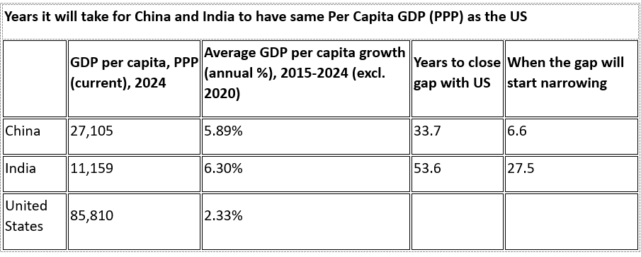
This can also be applied to the income gap between countries. Take China and India on one hand, and the US on the other.
If China and India grow their per capita GDP at 2.5 times and 2.7 times faster than US (going by the average annual growth rate over the past ten years). China will catch-up with US's per capita GDP (PPP) in 34 years while India in 54 years. For China, the absolute gap will continue to grow and only start closing in seven years, while it will take India 28 years for the gap to stop growing and start shrinking.
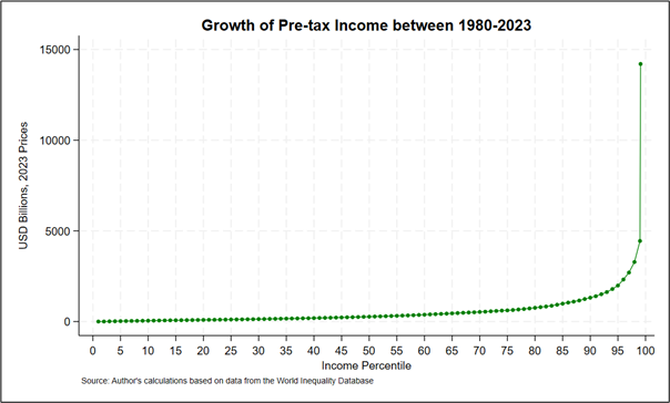
At the global inequality level, this means that although, when you look at the elephant graph, the bottom half have been growing, this is from a very low base. Looking at the absolute and not relative incomes, the winners of the last forty years are clearly the richest income earners. Someone in the bottom 50% who in total captured only 9.2% of global income growth, has seen their average annual income rise by only USD 744 (at market exchange rates, 2024 prices), in 40 years,[i] whilst someone in the top 1%, who in total captured 21.6% of global income growth has seen their average income rise by USD 164,435, or 218 times as much.
If you plot this absolute income growth, you get a graph that looks perhaps a bit more like a giraffe than an elephant.
Absolutes matter too
The global Gini of relative incomes is the most widely used measure of global inequality. It has been falling for nearly two decades (although this fall has slowed sharply in recent years and the outlook is not good). However, because it is a relative measure as discussed above, it misses a crucial aspect of inequality- that intuitively makes more sense to most- we are more equal when we have similar levels of actual money, not similar levels of percentage increase. Looking at the data from the World Income Inequality Database, the absolute Gini for global inequality is growing, not shrinking even while the relative Gini Index has been falling.
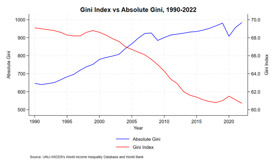
So, whilst there is no doubt the growth in the countries of the Global South and especially in China has reduced the gap, the size of that gap, in absolute terms remains enormous, and continues to rise, not fall.
END.
Thanks to my brilliant colleague Anthony for his considerable help on this one; both in writing and doing the numbers.
[i] Authors’ calculations based on the data from the World Inequality Database. (n.d). https://wid.world/data/. Data for 1980 and 2023. The pretax income has been converted from US dollar purchasing power parity to market exchange rates, 2024 dollar.
Author: Max Lawson, Head of Inequality Policy at Oxfam International and EQUALS podcast co-host. He is also a visiting Professor in Practice at the LSE International Inequalities Institute and the co-chair of the Global People’s Medicines Alliance.
Listen to the latest EQUALS episode featuring Luc Triangle, on how the fight against inequality is inseparable from the fight for democracy. New episode drops Tuesday, stay tuned.
Always remember to share and follow us on X and on LinkedIn.