

How much have billionaires made during Davos this week?
The numbers behind Oxfam’s new billionaire counter

Oxfam’s latest campaign tool, a tracker that counts how much billionaires are making every second, and what that money could pay for, launched last night.
The tool goes alongside Oxfam’s latests flagship inequality report ‘Rule of the Rich’, which coincides with World Economic Forum in Davos. Under the hood, there’s some very interesting research that drives the numbers.
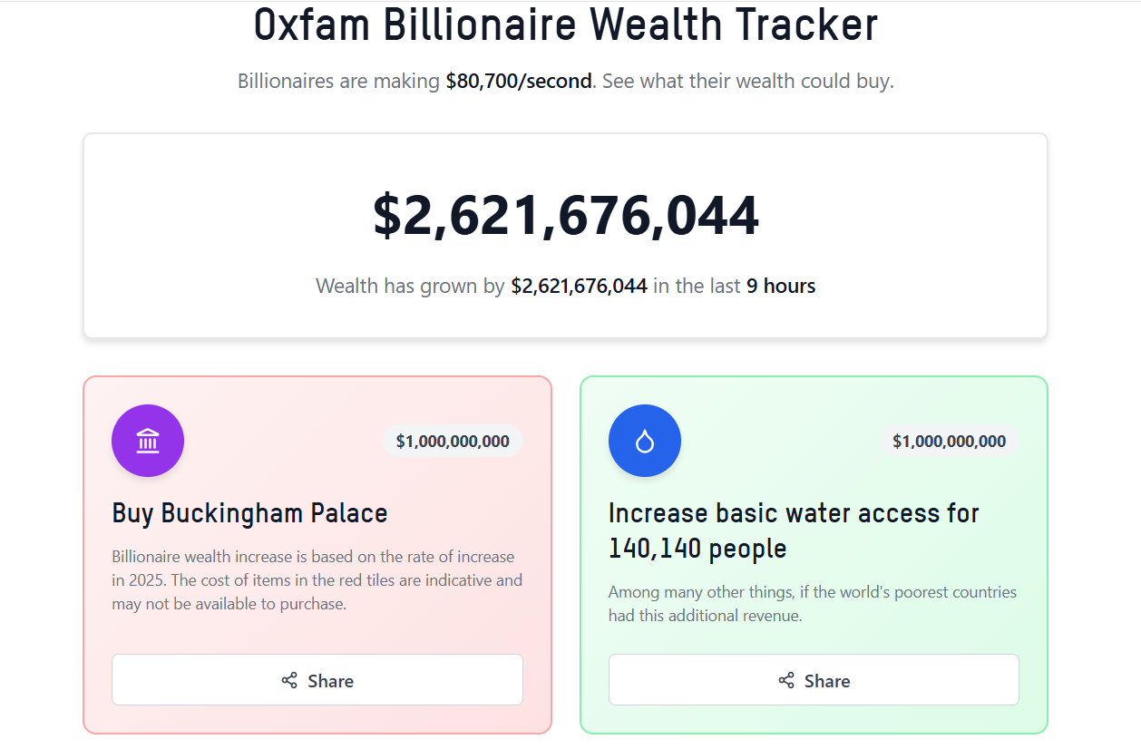
The purpose of the tool is to put the enormous wealth gain of billionaires into perspective – it’s hard to wrap your head around numbers as large as billions or trillions. Over the last year, billionaire wealth increased by $2.5 trillion, or $80k a second, which is what the ticker is based on, rather than pulling data from markets in real-time.
The ticker isn’t proposing a specific tax rate (that’s covered in depth in a different report) or claiming that this wealth gain is available cash (most billionaire wealth is invested in company shares); it is purely one way of communicating obscene levels of wealth inequality.
At every billion-dollar milestone, the website shows two tiles with what that money could have been spent on.
The red ones are luxury items. A billion dollars could buy Buckingham Palace. For $25 billion, which billionaire will have made by day 3 of Davos, they could fill 200 Olympic-sized swimming pools with champagne. For $35 billion, what billionaires make in a week, they could buy all the art in the Louvre.
It goes without saying that these are just indicative, an attempt to put the scale of wealth into perspective. Buckingham Palace and all the art in the Louvre aren’t for sale, and even billionaires are probably not crazy enough to fill swimming pools with champagne!
Some of these numbers are based on public estimates; for example, the valuation of NFL teams is tracked by Forbes, and the cost to build a luxury underwater city is based on a conceptual idea. Others are more back-of-the-envelope calculations. The cost to make the Statue of Liberty out of gold is based on replacing her copper with gold - no calculations of the structural integrity were made!
More interesting are the green tiles. These show what the governments of low and lower-middle-income countries could do if they had this extra revenue. The tiles alternate between various Sustainable Development Goal (SDG) related indicators, but it is part of a model that shows what would happen if countries had additional revenue in their entire budgets. The $1 billion tile will show that 140,140 people would have increased access to basic water, but it would also mean:
258,563 additional children in education
1,241,472 people with increased access to electricity
31,616 additional nurses
and 11,855 additional teachers…amongst the many other things governments spend money on (like infrastructure or defence).
This is just one year of additional government revenue and covers low and lower-middle-income countries only.
The data is driven by The Government Revenue and Development Estimations (GRADE) tool, a research project from the University of St Andrews and the University of Leicester in the UK. The idea of this model is to translate what increasing or decreasing government revenue has on the Sustainable Development Goals.
The tool is a game-changer for those who want to communicate the impact of increasing or decreasing government revenue. It’s been used, for example, to model the impact of reducing the debt burden of the poorest countries, the harm caused by tax avoidance and the benefits from a fairer tax system. For any campaigner or policymaker involved in fiscal justice and access to public services, it’s an underutilised tool that’s easy to use, publicly available and covers nearly every country in the world.
There are some very interesting features about this model worth highlighting.
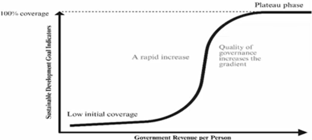
It’s a non-linear econometric model. This means it is more sophisticated than simply projecting that for every $1 spent, something will happen. Put simply, if revenue increases a small amount, then little happens, but it gets to a point where there’s very rapid returns, followed by a plateau phase, where it’s not possible to improve things further (you can’t get more than 100% of people with access to electricity, for example).

The model takes into account governance. As Government revenue increases, the quality of governance tends to increase, and so there is less revenue lost to corruption, etc. The model also includes governance indicators that show how increased resources improve governance itself, which in turn improves SDGs, creating a virtuous circle.
It shows the trade-offs – or lack of. For example, in 2019, Nigeria lost $689 million in corporate tax because of revenue because of profit shifting to the Netherlands. The Netherlands gains from this arrangement but if the Nigerian government had additional revenue equivalent to these losses, this would avert around 651 child deaths annually in Nigeria while causing zero additional deaths in the Netherlands. This is because the Netherlands already has extremely high health outcomes; reducing revenue slightly has no measurable effect on this indicator.
It’s realistic and non-prescriptive. Because it allocates extra revenue to an entire budget, rather than a specific purpose, as would be the case for any new revenue source for a government, it gives a more realistic view. Other expenditures go up beyond SDG-related ones, even military spending, as the model assumes that new resources are spent in the same proportions as historically.
Huge thanks to Dr Bernadette O’Hare, Dr Stuart Murray and Professor Stephen Hall and the GRADE team for their technical support with the model. Check out the GRADE tool here and post any questions you have in the comments below.
 | A guest post by
|